How to validate a startup idea with design


Subscribe to receive Elixir news to your inbox every two weeks.
Expand your skills
Download free e-books, watch expert tech talks, and explore open-source projects. Everything you need to grow as a developer - completely free.
You don’t need to code a full product to find out if you’re on the right track. This post will show you how to use design to validate your startup idea quickly and cheaply, before you write a single line of code.
You’ve got a startup idea burning a hole in your brain. Maybe it came to you in the shower or during yet another frustrating work process. You’re excited (and a little terrified) because you see the potential – if it works. But here’s the thing: before you pour months of time and money into building anything, you need to know if your idea actually solves a real problem. Too many founders skip this step and end up learning the hard way. In fact, lack of market fit is a top reason startups fail (34% in one study)
Why bother? Because early validation saves you from building the wrong thing. It’s like scouting a trail before hauling your entire wagon down it. Legendary startups have done this:
- Dropbox famously validated demand with just a 3-minute demo video (netting 75,000 signups overnight with zero product built).
- Zappos tested its concept by manually selling shoes online without any warehouse or fancy app – CEO Nick Swinmurn simply posted photos of shoes from local stores and ran to buy them at retail whenever an order came in, literally delivering on the promise by hand. He lost money on each sale, but he gained something priceless: proof that people would buy shoes online.
These scrappy design-first tests saved them from months of potentially building the wrong solution. You can do the same. Let’s dive into how.
Define the problem before the solution
Early-stage founders often make the mistake of falling in love with a “cool idea” or technology, only to discover nobody actually needed it. Don’t let that be you.
Every great startup starts with a real problem. So ask yourself: What pain point am I solving, and for whom? Be specific. Define the problem, not your idea’s features. As one framework puts it, “Write down the problem you want to solve. Try to keep it to a simple statement.”. Early-stage founders often make the mistake of falling in love with a “cool idea” or technology, only to discover nobody actually needed it. Don’t let that be you.
Start by identifying your target user and their biggest pain related to your domain. Is this problem one of their top three daily headaches, or a “nice-to-have” annoyance? If it’s not a top-tier pain point, you may need to dig deeper or pick a different problem. For example, if you’re building an app to help busy parents schedule playdates, you’d want to confirm that scheduling playdates is truly a frustrating issue for many parents (and not already solved by group texts or Facebook).
How do you confirm the problem is real?
Talk to people – before you pitch them your solution. The goal at this stage is to validate the problem, not your imagined solution. This means having open-ended conversations about your users’ experiences and challenges. Resist the urge to lead with “Would you use a product that does X?” (people will often say yes just to be polite or optimistic). Instead, ask questions that get them to reveal their genuine pains and current hacks. For instance, try questions like:
- What’s the hardest part about [the problem] for you?
- How are you currently dealing with [the problem], and what’s frustrating about that?
- If you could wave a magic wand, what would a perfect solution let you do?
If five out of five people you interview shrug and say “Hmm, I guess that issue isn’t a big deal,” that’s a red flag.
Notice none of those questions are pitching your idea – that’s intentional. If you directly ask “Would you use my app that does XYZ?”, you’ll often get fluff answers. People might say yes just to be nice; you’re not looking for flattery, you’re looking for insight.
So keep your interviews focused on them: their routines, pain points, workarounds, and thoughts. Listen more than you talk. A handy mindset is to treat your idea as a hypothesis about a problem/solution that you’re trying to disprove. You’re not seeking validation for your ego; you’re seeking the truth. If five out of five people you interview shrug and say “Hmm, I guess that issue isn’t a big deal,” that’s a red flag (and a sign to either pick a new problem or a new segment of users). But if their eyes light up or they rant for 10 minutes about how much it sucks, bingo – you’ve found a real pain worth solving.
Design-led validation: storyboards, flows, and wireframes
Once you’ve defined a solid problem, it’s time to explore solutions – but through design, not code. Think of this as visual brainstorming with a purpose: you’re creating simple design artifacts to simulate the user experience and gauge if your idea holds water. The goal is to validate the concept and approach before anyone writes a single line of software. Here are a couple of design-driven methods to try:
Storyboarding the user journey
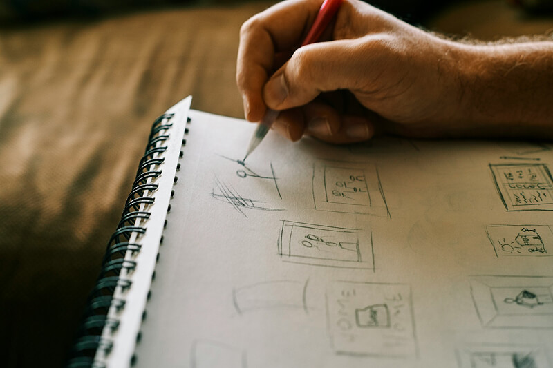
This is one of the most powerful (and cheapest) ways to vet an idea. Draw out a storyboard of how a user would interact with your solution in the context of their life – like a comic strip of the customer’s day. You don’t have to be an artist (stick figures and arrows are fine!). Map out the key moments: what triggers them to seek a solution, how they discover or access your product, what steps they take, and the outcome. By visualizing it, you and your team (or investors) can spot holes or magical thinking. More importantly, you can show it to target users and ask, “If it worked like this, would that solve your problem?” This lets you test your assumptions about the journey. Storyboards keep it human: they focus on why and how a user would do something, without getting bogged down in UI details. In fact, storyboards are a staple of design thinking because they force you to frame the solution around the user’s needs and context. They’re great for aligning your team, too – everyone can literally see the vision. Storyboarding is about decision-making; it gives teams the chance to validate direction before investing in pixels or features. In other words, it’s a cheap way to sanity-check the big picture.
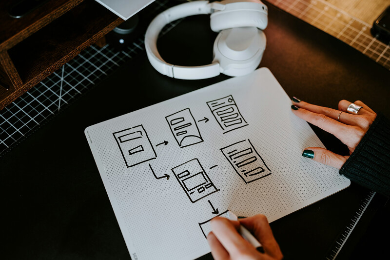
User flows and mock customer journeys

Closely related to storyboarding is mapping out user flows. This is more about the functional steps a user takes in your product. For example, list out the flow for a new user signing up and accomplishing the main task. Even at a high level, writing down the sequence (e.g., “User opens app -> creates profile -> enters data X -> gets result Y”) can reveal complexity or assumptions. Are there steps you can simplify? Any where users might drop off? Once you have a few core flows, you can run those by potential users: “Would you expect it to work like this?” or “What would you want to happen next at this step?” If you have the resources, turn a user flow into a quick clickable wireflow (link some rough screens together) and let someone step through it. This early feedback is gold – it might show you that users expect a different flow entirely. Keep it simple: these should be low-fi sketches or wireframes, not polished UI. The rougher it is, the more likely users will give candid feedback (“I don’t get what I’d do here”) instead of commenting on the color of a button. Even a sketched wireframe can communicate the idea. One approach is a wireframe storyboard, where you use sketched screens in a sequence to tell the story. The emphasis stays on user behavior and goals rather than pretty visuals
Paper prototypes & napkin sketches

Want the fastest design test possible? Grab paper and pen. Draw the app screen or web page on paper, including the key buttons or content (seriously, hand-drawn squares and scribbles work). Then literally put it in front of someone and say, “Show me how you’d accomplish [task] with this.” You can simulate interactions by swapping pieces of paper (“You clicked this, now this screen appears”). This sounds goofy but it’s amazingly effective. Paper prototypes are very cheap to change and you can get reactions in minutes. If your friend looks at your sketch and says “I have no clue what I’m looking at,” that’s valuable to know! It means your concept or interface needs clarifying before you invest in digital design. Paper prototypes are great for honing in on core functionality.
Minimum fidelity for maximum learning.
At this stage, keep everything lightweight. The mantra is “minimum fidelity for maximum learning.” The point of design-led validation is not to produce a production-ready design spec; it’s to flush out misunderstandings and gauge interest/usefulness early. As one designer put it, the best prototype is the simplest one that gives you a clear signal on your assumption. If a whiteboard sketch in front of a customer can answer your question, do that instead of a high-fidelity mockup. Remember, you’re not trying to impress users with gorgeous visuals right now – you’re trying to see if the idea makes sense to them and solves their problem. In startup land, ugly and useful beats beautiful and useless every time.
Prototype to get feedback (low-fi vs. high-fi)
After hashing out some flows and sketches, you’ll likely want to build a prototype that people can interact with – something closer to the real experience, but still much faster and cheaper than a real product. Prototyping is where design truly shines for idea validation. It allows you to create a facsimile of the product experience and put it in front of users to observe what they do. Crucially, a prototype does NOT need to be fully functional or scalable. Think of it as a magic trick: you’re faking the functional parts behind the scenes to simulate the experience. It doesn’t even have to look like your final solution, as long as it tests the question you need answered.
When prototyping for validation, you have options on the fidelity spectrum.
Start low-fi, then increase fidelity as confidence in the concept grows.
Low-fidelity prototypes
These include sketches, paper prototypes, basic wireframes, or even a role-playing exercise. Low-fi prototypes are quick, rough, and inexpensive. The advantage of low-fi is you can make many of them and iterate fast – you’re not attached to a sketch you made in 5 minutes, so if users hate the idea, you toss it and try a new approach. Low-fi prototypes are perfect for the early “divergent” stages of design, when you want to test a lot of different concepts cheaply.
For example, you might sketch three different layouts for your app’s home screen and ask people which one they find more intuitive, or you might use a bunch of Post-it notes on a wall to mimic an interface flow. Low-fi = fast learning: Since they’re so quick to make, you’re more willing to let a bad idea die (and that’s a good thing). Use low-fi prototypes to test broad concepts: e.g., “Would users even be interested in a tool that does X?” or “Which of these 3 approaches makes more sense to solve the problem?”
High-fidelity prototypes

These are closer to the real deal – polished visuals, interactive elements, maybe even some coded parts. High-fi prototypes take longer to create, but they can be useful once you have a solid direction and need to iron out details or impress stakeholders. For instance, a high-fi prototype might be a clickable mockup in Figma that looks almost like a finished app, complete with realistic data. High-fi shines when testing fine usability points: can users figure out this complex interaction? Does the visual design instill trust? However, don’t rush to high-fi too soon. You want to avoid spending weeks on a beautiful prototype only to discover the core idea is flawed.
Choosing the fidelity often comes down to what you need to learn. If your big question is “Will anyone even care about this solution?” then a landing page or sketch might do the job. If instead you’re trying to refine how it works, a more detailed prototype might be warranted. A common path is: sketches -> wireframes -> hi-fi mockup -> coded MVP, stair-stepping fidelity as you validate along the way.
Tools for prototyping & getting feedback
Figma
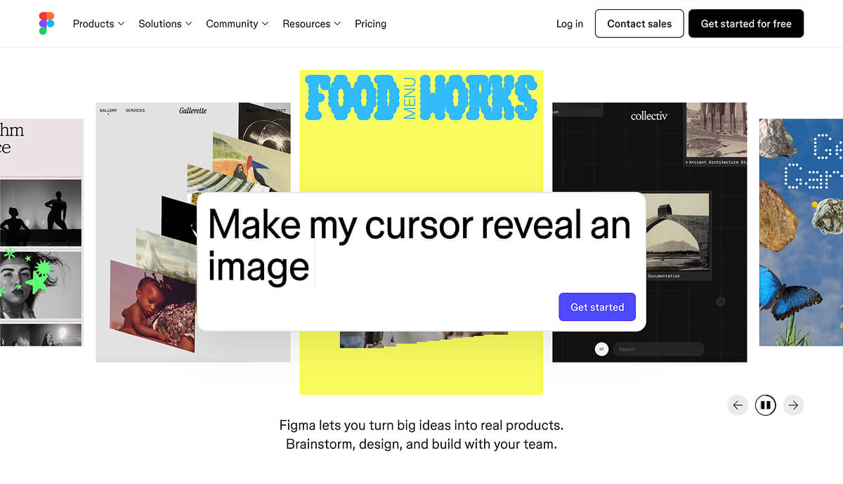
The go-to design tool for many startups, great for making both low-fi wireframes and high-fi designs. You can create clickable prototypes in Figma itself by linking frames together. It’s collaborative, so your whole team can view or comment on the design easily. If you’re asking yourself, “Do I need a design system or pixel-perfect UI for my MVP?”, the answer at this stage is no – Figma can help you whip up something that looks decent without full-on code, but keep it as simple as possible. You’re not building a scalable design system yet; you’re validating a concept.
Maze
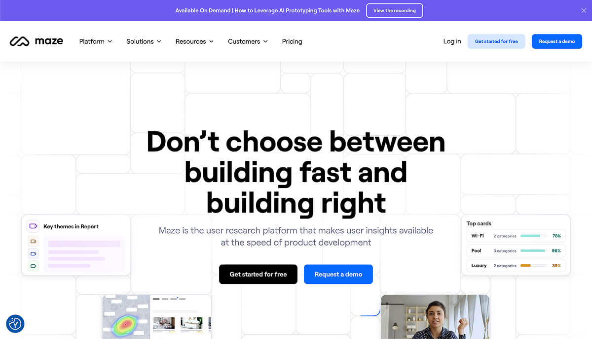
Maze is a user testing platform that pairs nicely with Figma (and other design tools). You can import your Figma prototype into Maze and create a test for users to complete specific tasks on it. Maze will then collect metrics and feedback – like where people clicked, how long it took, where they got stuck, etc. It’s like having a robot UX researcher crunch the data for you. Maze’s big promise is to “validate your designs before writing a single line of code” by getting rapid feedback from real users. For example, you might design a prototype of your onboarding flow and use Maze to see if users can successfully get through it and understand it, without you standing there to guide them. If 8 out of 10 users in Maze testing fail to find the “Next” button, you just caught a huge UX issue before any coding happened (and you can fix the design and test again).
(A quick founder aside: fancy tools are great, but even a PowerPoint or Google Slides click-through can work in a pinch. I’ve seen founders print paper screens and shuffle them to simulate an app. Use whatever gets you useful feedback fastest. As the Lean Startup mantra goes, it’s about the fastest way through the Build-Measure-Learn loop. Sometimes that’s a high-tech prototype, sometimes it’s a guerilla paper test.)
You’re not trying to prove your idea is perfect; you’re trying to learn whether it’s viable and how to improve it.
One key mindset with prototyping: treat it as an experiment. You’re not trying to prove your idea is perfect; you’re trying to learn whether it’s viable and how to improve it. Each prototype should be built with a clear hypothesis in mind (“I assume users will want to use this feature” or “I assume they understand this workflow”). When you test it, you’re looking to confirm or refute those assumptions. It’s a win-win: either you validate an assumption (great, carry on) or you invalidate it (even better – you just avoided a pitfall and can pivot). This way, failure in prototyping is actually a success, because it steers you closer to something that will work. Keep prototypes cheap and quick precisely so that you’re not afraid to scrap them based on feedback.
Test your design with real people
You’ve defined a problem, sketched a solution, maybe even clicked through a prototype yourself. It’s feeling pretty good to you… which is exactly why you must now test it with actual users. Founders, PMs, and designers are notoriously bad at objectively evaluating their own ideas – we’re too close to it. Real users will be honest, often brutally so, in revealing what doesn’t work. This step is where the rubber meets the road.
Recruiting test users
Aim for people in your target audience – if you’re building a tool for accountants, get some accountants; if it’s a consumer app for busy moms, find busy moms. In early stages, friends-of-friends and personal networks can work if they somewhat match the profile. You don’t need hundreds of testers. In fact – and this is important – you only need a handful of users to get invaluable insights. Usability research by the Nielsen Norman Group shows that testing with just 5 users can uncover ~85% of core usability problems in a design. After about 5 people, you hit diminishing returns, seeing the same issues repeat. So start small: even one user test is infinitely better than zero (literally, “zero users give zero insights”. The difference between doing nothing and watching just one person use your design is night and day – you’ll almost always catch something that you overlooked.

Don’t worry if your prototype is rough – that’s a plus. You’re not launching to these users, you’re learning from them. Here’s how to run a simple user test or interview:
- Create a scenario: Give the user a bit of context, then a task. For example, “Imagine you heard about this new app that [does X]. You’ve just signed up – now see if you can use it to accomplish [goal].” If you’re doing an interview without a prototype, frame a scenario around their problem: “Let’s say you’re trying to [solve problem]. Can you walk me through how you’d approach it?”
- Be quiet and watch: This is the hard part – as the creator, you’ll want to jump in and explain things or help the user. Don’t (unless they’re completely stuck for a while). Observe where they click, what they read, what confuses them. Encourage them to think aloud: “Tell me what you’re looking for now” or “What did you expect when you clicked that?” If you’re showing a storyboard or sketches, you can ask open questions like “What do you think is happening in this step?” or “How do you feel at this point?” The goal is to see your idea through their eyes. Take notes like a madman/madwoman – especially on emotional reactions (did they hesitate, frown, smile, get excited at any point?).
- Stick to your script (loosely): It helps to have a few key questions or tasks written down so you cover all your points, but don’t make it a rigid script. A conversational tone puts people at ease. If they say something intriguing or unexpected, follow that thread. Some of the best insights come from offhand comments users make (“I was hoping it would do ____ here” or “This part reminds me of [other app]”). Use your question list as a guide, not a questionnaire.
- Interview vs. usability test: Know what you’re doing in each session. If the user is interacting with a prototype, it’s a usability test – focus on where they struggle or what they enjoy. If you’re just discussing a problem or concept (no prototype), it’s more of an interview – focus on understanding their needs and perspective. Either way, avoid selling. Don’t defend your design or say “Oh, yeah that part’s still in progress.” Just note the issue – if they’re confused, that’s on the design, not the user. Encourage honesty by making it clear, “We’re testing the design, not you. If something is confusing, it’s actually super helpful for us to know that.”
- Small numbers, many iterations: As mentioned, 5 users is a great benchmark for a round of testing. After those tests, step back and synthesize what you learned. You’ll likely have a list of things to fix or questions that arose. Tackle the most critical issues, adjust your design (iterate), and then test again with a new set of 5 users. This beats doing one massive test with 30 people at the end. It lets you course-correct continually. It’s much easier to change a prototype than a live product, so find the flaws now. As one UX expert puts it, running many small tests and constantly improving yields a far better end result than one big polished launch test.
During these tests, pay special attention to patterns in feedback. Did multiple users get stuck at the same step? Did everyone ask “What does this term mean?” about a label? Those are clear problem areas. Likewise, if several users spontaneously say “Oh cool!” at some feature, that’s a strong positive signal you’re onto something with that aspect. One or two outliers might be flukes, but when you start hearing the same reactions repeatedly, you’ve found something real – be it a real problem or a real delight.
Also, qualitative insight is key here. We’re not in analytics land yet; a lot of what you learn will be why people do or don’t like something. Listen for those “why” answers and ask follow-ups. A user saying “I don’t like this” isn’t useful until you dig into why – maybe it requires them to do extra work, or it’s something they don’t trust, etc. Often it’s the why that points you to either a fix or a deeper understanding of your user.
Finally, recognize that user testing can be humbling. You will almost certainly discover that something you thought was obvious is utterly confusing to others. That’s okay – better to learn it now than after launch. Keep reminding yourself and your team: this is progress. You’re learning and iterating while the stakes are low.
Iterate or kill fast (know when to pivot)
After gathering feedback from real users, you face the moment of truth: Do you iterate on the idea, or do you pivot/kill it altogether? The whole point of validation is to get to this decision point before you’ve sunk tons of resources.
Look for decisive patterns in reactions
If the feedback from your tests is largely positive, with users expressing genuine enthusiasm and only minor suggestions, that’s a green light to refine and proceed. More often, you’ll get a mix of pros and cons. Parse them carefully. Is there a common pain-point that everyone still experiences even with your solution? (Uh oh, maybe you solved the wrong problem.) Did testers uniformly ignore a feature you thought was key? (Maybe it’s not that important – or your onboarding didn’t highlight it.) On the darker side, if you struggle to find any strong positive signals – e.g., testers were lukewarm or confused about the core value – take that extremely seriously.
Multiple “meh” reactions are usually a sign to change direction fast. As startup coaches often say, the opposite of love isn’t hate, it’s indifference. Indifference from potential users is a death knell. It’s better to hear “I wouldn’t bother with this” now, than after you’ve burned a year of cash. As painful as it is, be ready to pivot (change some aspect of your idea) or even kill the idea if the validation shows it’s not solving a big enough problem. Remember, ideas are hypotheses – if yours is disproven, it’s not personal failure, it’s just data telling you to try something else.
Use feedback as your compass

The key to knowing when (and how) to pivot is feedback. Think of user feedback as a compass that points you toward True North (product-market fit) or warns you when you’re off-track. Successful pivots almost always originate from insights gleaned in validation. Maybe users loved part of your solution but didn’t care about another part – pivot to focus on the part they love. Or you might discover through interviews that the problem you set out to solve isn’t the one they actually want solved, but another related problem is – pivot to that. For example, suppose you built a task management app aimed at designers, but in testing you find designers don’t really need another to-do list. However, a few mentioned their bigger pain is getting client feedback. A smart pivot might be to address that adjacent pain. Stay flexible and listen to what the market (even in tiny sample size) is telling you.
Be honest about red flags
If you’re hearing polite “this is nice” rather than “when can I have this?!” consider that a yellow flag at least.
Some red flags that suggest it’s time to pivot or punt include: users clearly have the problem but aren’t excited by your solution (meaning your approach might be off), or users don’t really have the problem you expected (meaning your premise might be off). Another is if your tests required lots of prompting or users still didn’t “get it” – it could indicate the value prop is too convoluted. If you’re hearing polite “this is nice” rather than “when can I have this?!” consider that a yellow flag at least.
Building something no one wants is the most expensive mistake in startups, so if early feedback suggests lack of need, it’s far better to pivot now than to double down out of pride. Early feedback lets you adjust course before making costly mistakes. In practice, this might mean scrapping a feature, changing your target user, or rethinking the core idea entirely.
Know what not to pivot on
On the flip side, don’t overreact to every minor gripe. Small usability issues can be fixed in the next design iteration – that’s an iterate situation, not a pivot. If users love the concept but hate the color scheme, rejoice! That’s an easy tweak. If they want one extra feature, you can consider it (just guard against scope creep). Pivoting is for when something fundamental isn’t working: the problem, the market, or the core value prop. One rule of thumb: if users universally agree on the problem but not on your solution, pivot your solution approach; if users shrug at the problem itself, pivot to a different problem. And if a subset of users love it but another subset doesn’t care, maybe you need to reposition your target audience.
Rapid iteration when you’re close
If validation shows you’re on track but with a few bumps, iterate quickly. Adapt your design or concept to address the feedback and test again. This cycle can repeat multiple times (design is iterative by nature). Each loop you’re de-risking the idea further. Maybe in round 1 of tests, 3 of 5 users were confused by the pricing page, so you redesign it; in round 2, everyone understands it – great, that risk is mitigated. You keep going until you reach a point where users are succeeding in tasks and expressing that the product is valuable. Those are strong signals you’re ready to move into building the MVP for real. The ultimate feeling you want is confidence that “We’re solving a real problem in a way that users understand and want.” You won’t get 100% certainty (you never do), but you can get a solid thumbs-up from a decent sample.
One more thing: Don’t take pivoting (or killing an idea) as a tragedy. The tragedy is spending a year on something that fails because you didn’t validate early. Pivoting is a mark of strength, not weakness – it means you learned and are adapting. The startup graveyard is littered with products that the team stubbornly built despite warning signs. By validating with design first, you’re ensuring you won’t join that list. Embrace the mindset that your startup idea is an evolving hypothesis. As the famous startup saying goes, ideas are cheap, execution is everything – but executing on the right idea is even more important. Use validation to make sure you have that right idea.
And if all signs truly point to “this just isn’t a viable idea,” take heart. You saved yourself an immense amount of heartache and resources. You can pivot to a new idea or approach with the knowledge gained. Many founders go through multiple ideas before hitting one that sticks. What you learn from each attempt only makes the next one stronger.
Takeaway checklist for idea validation
Before you rush back to coding, here’s a quick checklist to keep you grounded in validation mode:
- Fall in love with the problem, not your solution. Make sure you’re solving a pressing pain for a specific user group. Validate that the problem is real by talking to users; write a clear problem statement to keep you focused. If you can’t find anyone who strongly cares about the problem, stop and reconsider.
- Use design artifacts to think it through (and flush it out). Sketch the user journey in a storyboard or map out the user flow. Visualize the experience before building it. This will expose assumptions and missteps early, and it gives you a tangible story to share with others for feedback. It doesn’t need to be pretty – diagrams, stick figures, wireframes, whatever gets the job done.
- Prototype fast and cheap. Start with the lowest fidelity prototype that can test your assumption – a sketch, a paper mock, a fake landing page, you name it. Your prototype is a means to get user feedback, not an end itself. Only increase fidelity when you need to answer more detailed questions. Remember, an MVP doesn’t have to be coded; it can be a video, a demo, a Wizard-of-Oz manual simulation – whatever validates the concept
- Test with real users (even if it’s 5 or less). Don’t skip this. Watching even one person use your design or explain their pain point is immensely enlightening. Aim for ~5 users per test round, which is enough to catch the majority of issues. And do multiple rounds – test, fix, test again. No user testing = flying blind.
- Be ready to iterate or pivot based on evidence. Go into validation with an open mind. If users struggle or aren’t interested, act on that feedback. Iterate your design or concept and test again, or pivot to a new angle if needed. Don’t waste time defending a doomed idea – use your energy to find one that clicks. Feedback is your friend, even when it’s hard to hear. As one founder put it, the sooner you embrace that your idea is a hypothesis to be tested and refined, the faster you’ll find a version that works
- Don’t get seduced by “building” too early. Writing code can feel like progress, but building the wrong thing is just digging a hole deeper. Design first, code later. Use the design phase to de-risk your idea as much as possible. Your future engineering team (or your own schedule) will thank you.
- Don’t seek only validation; seek truth. It’s nice to have people say “I love your idea!”, but you learn more from a raised eyebrow or a confused look. Encourage testers to be candid. Ask them what they don’t like or what they’d do differently. Every hesitation or critique is a chance to improve.
By following these steps and mindset, you’ll dramatically increase your chances of building something people actually want and need. Validating with design isn’t about adding extra work – it’s about making sure the work you do invest is on the right track. It’s scrappy, it’s practical, and it lets you move fast and smart. In the frenzy of early startup life, taking a little time to test and listen can be the difference between chasing a mirage and discovering a real opportunity. So before you “move fast and break things,” make sure you’re breaking the right things – and that there’s a real user on the other side who cares. Good luck, and happy validating!
Great design makes great products. Let’s make yours stand out.
Related posts
Dive deeper into this topic with these related posts
You might also like
Discover more content from this category

Basically, there are tons of digital products. Some of them are just new and fresh to the market and some of them have existed for many, many years.

Learn how to test startup ideas fast with simple prototypes. Real methods, clear steps, and honest signals founders can use before writing any code.

A guide for early-stage startups to do UX research fast and cheap. Learn how to recruit real users, run interviews in a week, and get genuine product insights without breaking the bank.