Stop overdesigning: What to skip before Product-Market Fit


Join Elixir newsletter
Subscribe to receive Elixir news to your inbox every two weeks.
Expand your skills
Download free e-books, watch expert tech talks, and explore open-source projects. Everything you need to grow as a developer - completely free.
Learn what design work to skip before product-market fit. Focus on clarity, speed, and user learning—not pixel perfection.
You’ve got a prototype. Maybe a few early users. Some traction, maybe a lot of uncertainty. And yet, you catch yourself opening Figma again - tweaking, polishing, debating colors, or thinking, “Maybe we should start a design system.” If that sounds familiar, you’re not alone. Every founder, PM, and designer who cares about quality hits this stage: that moment when the product “sort of” works, but doesn’t feel polished enough.
You want it to look credible, trustworthy, maybe even beautiful. But here’s the reality:
Before product-market fit, overdesign is one of the fastest ways to stall your progress.
Not because design doesn’t matter, but because you’re solving the wrong design problems at the wrong stage.
The goal right now isn’t polish. It’s proof.
The early-stage design trap
Overdesign is seductive. It gives the illusion of control. It feels like progress. And for people who love building, that’s a hard drug to quit. But if you’re pre-product-market fit, polish can become poison. Let’s unpack why smart, well-intentioned founders fall into this trap.
Pride in craft
You care about quality, and that’s a good thing. You want your product to look like something you’d be proud to show investors or your peers. But at this stage, pride can easily morph into perfectionism. You’re not designing a finished product - you’re designing a learning tool.
Fear of looking amateur
No one wants their startup to look like it was built in a garage (even if it was). But here’s the paradox: early adopters often forgive and even prefer a rough first version if it actually solves their problem. They’ll trust results over visuals.
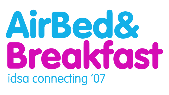
Case in point: Airbnb
When Brian Chesky and Joe Gebbia launched their first version in 2008, it was a basic site with poor photos and clunky UX. The hosts uploaded grainy images that made the apartments look terrible. Instead of redesigning the interface, the founders grabbed a camera, visited hosts in person, and replaced the bad photos themselves. Within a week, bookings doubled. The insight wasn’t “we need a better UI.” It was “our users don’t see value because the product doesn’t communicate trust.” That’s design thinking, but expressed through learning, not polish.
Comparison
You’re looking at big-budget products built by teams of 50+ designers and thinking, “Our UI doesn’t look like that.” Of course it doesn’t, they’ve spent years refining it. You’re still validating whether your idea deserves that level of investment.
False sense of progress
When you make something look good, it feels like the product is better. But polish can hide weak fundamentals. You might convince yourself something’s working because it looks “done.” It’s a comforting illusion that can waste months. As one founder put it after burning $100k on an overdesigned MVP that nobody wanted:
We built a masterpiece nobody needed.
In short: early design should focus on learning, not impressing. Or as Facebook famously wrote on the wall: “Done is better than perfect.”
Why overdesign slows you down
Every hour spent perfecting UI is an hour not spent validating your core value. And in the pre-PMF phase, validation speed is everything.
Here’s how overdesign quietly drains your momentum:
- You waste cycles on unproven patterns. You polish features that may be removed next month.
- You lock yourself into rigidity. Premature design systems or style rules make iteration harder.
- You confuse signal with aesthetics. You’ll get surface-level compliments (“nice app!”) instead of real feedback (“this solves my problem”).
- You burn budget on polish instead of insight. That money could fund user interviews, faster iteration, or new experiments.
Startups don’t die from bad kerning. They die from slow learning.
What to actually focus on before Product-Market Fit
At this stage, design is about clarity, usability, and feedback. If your design helps you test faster, learn faster, and clarify your value, it’s doing its job.
Clarity
When someone lands on your product, they should instantly understand what it does and why it exists. No clever taglines. No abstract hero graphics. Clarity converts, confusion kills. A good early test: can someone who’s never heard of you describe your product in one sentence after 10 seconds? If not, simplify.
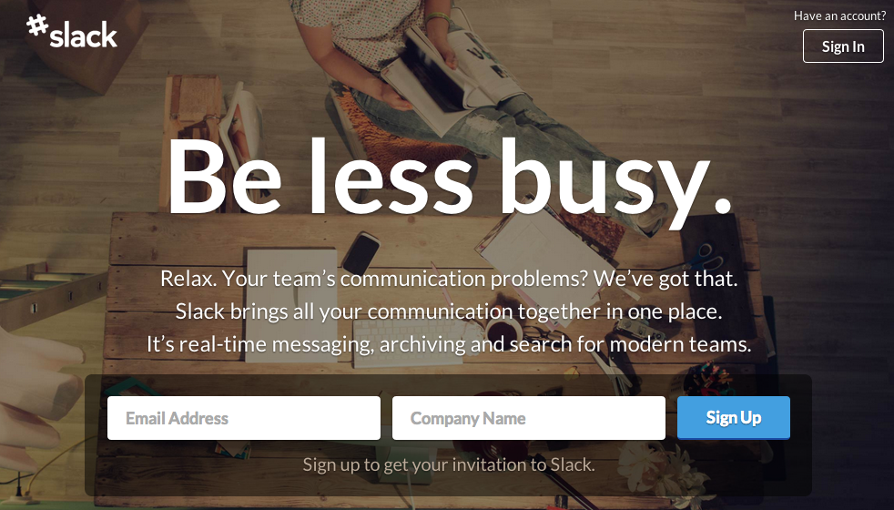
Slack’s early story illustrates this well. When they pivoted from a failed gaming startup, their first landing page was almost embarrassingly simple: a plain headline that said “Be less busy.” It wasn’t visually perfect - but it was crystal clear. That clarity fueled their first wave of adoption.
Usability
Make sure the core user flow, the one that delivers your product’s main value works smoothly end to end. Not the edge cases. Not the nice-to-haves. One complete, working path that delivers value. That might mean cutting 80% of your feature wishlist. But that’s a good thing. Each missing piece is a chance to learn whether people really need it.
Feedback loops
The faster you can test an idea, the faster you’ll find fit. Use quick prototypes, clickable wireframes to simulate. Every iteration should answer a learning question:
Did this make the user’s job easier? Did they care enough to come back?
Cohesion over consistency
You don’t need a perfectly consistent design system right now. You need coherent intent. It’s fine if one screen feels slightly different from another as long as users understand how to move through them. Early inconsistency is a sign of exploration, not failure.
What to skip (seriously, skip it)
You’ll thank yourself later for not doing these too soon.
The full design system
A design system is valuable after you have stable patterns and scale. Before that, it’s a trap. You’ll over-engineer rules for a product that’s still evolving and you’ll feel guilty every time you break them. Instead, use existing UI libraries like Material, Ant Design, or Bootstrap. You get enough consistency to look professional without slowing down experimentation. You’re not Google yet, and that’s a feature, not a flaw.
Pixel-perfect UI
An MVP’s job is to prove demand, not impress designers. Polish can come later. Early on, “good enough” visuals are strategic. If users stick around when your UI is clunky, that’s validation gold. Polishing before PMF is like detailing a car before you’ve built the engine. Sure, it shines, but it doesn’t move. Early Reddit and Craigslist are textbook examples here: ugly, dense, and full of text. But they nailed usability for a clear audience. They didn’t win design awards, they won users.
Heavy branding work
Branding before PMF is like decorating a house you might abandon next month. Have a basic logo, a few colors, a name that’s easy to spell and stop there. Even Google started this way. Their original logo was a multicolored wordmark with a drop shadow that looked like a kid’s project—but search worked brilliantly. Users didn’t care about the font. They cared that it found what they needed in milliseconds. Your real brand right now is your user experience and responsiveness. The best early brand strategy is helpfulness.
Fancy features and edge cases
Avoid “delight” features that distract from your main value. Skip elaborate onboarding tours, gamified dashboards, or custom illustrations. Focus on the core workflow. If 90% of users need one thing, make that flow excellent. Handle the edge cases later. Zappos famously did this. Before building inventory systems, they tested demand by posting photos of shoes from local stores. When someone ordered, they’d manually buy the pair and ship it. That “fake automation” proved the model and saved them months of wasted development. That’s design thinking at its purest: design the experience, not the infrastructure.
The mindset shift: design as discovery
Before PMF, design is a way of thinking. Every layout, button, or flow is a hypothesis. Your goal is to test it as cheaply and quickly as possible.
Start asking:
- What am I trying to learn from this design?
- Is this the simplest version that will give me a signal?
- Can I test it today, not next month?
This mindset reframes design as a research tool. Dropbox did exactly this when Drew Houston made a short demo video of the product before it existed. Thousands signed up. That video was design, too, it tested desirability before development.
Staying flexible and ready to pivot
Pre-PMF, your product might change drastically. If you overdesign early, every change becomes painful. Tightly coupled design systems, complex animations, and pixel-perfect layouts make it harder to pivot. Keep your design modular and lightweight. Use common components you can swap or reuse. Treat everything as a prototype, even the production UI. Your design should be as flexible as your business model.
There’s a reason product thinkers love the skateboard → scooter → bike → car analogy: build the simplest thing that moves, learn, and iterate.
Don’t waste months crafting a “perfect car” before knowing whether users even want transportation. That principle applies to design, too. Build the skateboard version of your UX. Learn fast. Improve deliberately.
What good early design actually looks like
- Communicates what the product does instantly
- Focuses on one end-to-end use case
- Lets you make changes daily
- Collects feedback effortlessly
- Feels cohesive, not perfect
Think of Airbnb’s first site, Reddit’s early layout, Notion’s sparse early interface. They weren’t elegant, but they were effective. Each focused relentlessly on value and learning. The best design early on is often invisible, it just gets out of the way of discovery.
When to level up your design
So when does polish start to matter? When your product feels stable. When users come back. When your team starts hearing consistent feedback about UX pain points rather than feature confusion. That’s when consistency, brand, and documentation start paying off.
You’ll know it’s time when:
- Engineers complain about scattered components
- Customers mention trust and experience
- The product scope stops shifting weekly
At that point, investing in a design system, brand consistency, and richer interactions becomes strategic. But don’t rush it. The pain of inconsistency will make itself known, you don’t have to guess.
Progress over perfection
Design, at this stage, is your tool for learning, not your trophy for execution. Your real competition is the speed of your own insight.
Startups die from indecision and overbuilding, not from ugly buttons.
So here’s the rule to remember: Design should move at the speed of learning, not at the speed of perfection. When you catch yourself debating pixel details, pause and ask: “Will this help me find product-market fit faster?” If not, skip it.
The early-stage design checklist
Do:
- Focus on the one core flow that proves your value
- Use design to test hypotheses, not to decorate
- Prototype fast and iterate daily
- Use off-the-shelf UI kits or frameworks for consistency
- Embrace a little design “debt”, you’ll fix it after PMF
- Keep talking to users; they’ll design your roadmap for you
Don’t:
- Build a full design system too early
- Polish visuals endlessly
- Delay launch for perfection
- Overbuild features or handle every edge case
- Spend weeks on branding before you have real customers
Momentum and clarity are your superpowers right now. Don’t let polish slow you down. Your job is to make something that matters.
FAQ: Common founder questions about early-stage design
Should I build a design system before product-market fit?
No. Use simple component libraries until you have consistent patterns. A design system only pays off when your product and team scale. Before that, it slows you down.
How polished should my MVP UI be?
Polished enough to be usable. No more. Users forgive rough edges if the value is clear. Think “clean prototype,” not “award-winning app.”
Do users care if my design looks amateur?
Early adopters don’t. They care if it works. If they stick with you despite clunky visuals, that’s the best validation you can get.
What’s the right time to invest in branding?
After PMF or when you have steady usage and predictable customers. Until then, your brand is your product experience.
Should I design for delight early on?
Only after you’ve nailed utility. Delight is powerful, but premature delight can distract you from solving the real problem.
What’s the biggest design mistake early founders make?
Confusing polish with progress. The MVP’s job is learning, not impressing. Don’t hide behind design work when what you need is real-world feedback.
Great design makes great products. Let’s make yours stand out.
Related posts
Dive deeper into this topic with these related posts
You might also like
Discover more content from this category
.png)
Update your startup brand after MVP without a full rebrand. Practical advice on refining brand identity, messaging, and design for early-stage founders.

Launched your MVP? Learn how to prioritize fixes, embrace user feedback, and skip over-polishing. Essential post-launch tips for startup founders,

Learn 10 high-impact UX improvements for early-stage web/mobile apps: from onboarding and microcopy to progress meters and trimming UI clutter.